In Almacora we have WPC panels that adapt perfectly to any space, even outdoors; Also the references have different color options available that you can shuffle when customizing those spaces in project.
Taking into account the color palette available, interior designers have a method of applying these within the spaces; this is based on choosing three different colors, of which one will be the dominant, an intermediate second and the last of the triad will be the least present but accentuating. The division is proposed in ratios of 60/30/10 to be distributed on site.
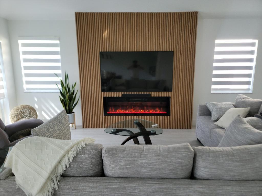
With light woods
In this case mainly combine bright and vivid colors such as blue, yellow, violet, red; depending on the personality you are looking for in your space so you could make other elements stand out and bring vitality to the room.

With dark woods
For dark woods it is preferable to look for light and modest tones that allow to balance the visual load of this with examples such as a beige, white or light blue that predominant weight is neutralized a little.
There are cases in which we do not want to cancel the weight of the dark tones, so that you could choose to accompany them with elements that resemble the tones of wood that predominates in the space.
In general
If there is a category of "infallible" we would certainly be talking about decorative elements and accompanying in green and natural tones. Plants can be a great ally as well as some shades of coffee that transmit vitality and avoid us being embedded in gloomy and dull spaces.
You can know all our catalog and receive personalized advice on your project by clicking here